
Jeff Clark - Portfolio
Last Updated Wed, 30 Sep 2009
This is a simple index into some of my more interesting or useful applications. Most of them are interactive and allow you to explore some data or create an interesting image. They were all created using Processing , which is built on top of java but specialized for use by visual artists and designers. Opening the interactive applications by clicking on some of the links below may take 15-30 seconds in order to start up java.
I'm currently available for data analysis or visualization projects if anybody is interested in working together. I live near Toronto, Canada but I'm open to projects done remotely. I would be happy with projects in size from a few days to a few months of work. Send me an email if you are interested.
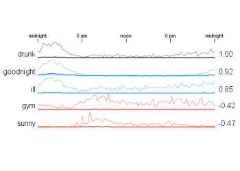 |
Time of Day Word Correlations show which words are used in tweets during the same times of day as well as the words that are negatively correlated over time. |
 |
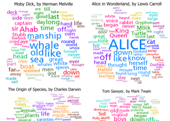
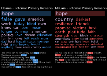
Accentuated Word Clouds are word clouds where the size of words is based on their frequency but also by their relative proportion in one text versus some baseline text. |
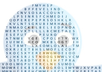 |
Shaped Word Search puzzles are like standard word search puzzles but shaped and coloured based on an underlying image. |
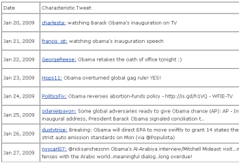 |
Characteristic Tweets are statistically selected to be representative of a set of tweets by use of words that are relatively prominent in that set compared to other sets. If a large collection of related tweets are broken into sets based on the time they were sent then this technique can build a 'tweet narrative' by choosing the most representative tweet from each time period. |
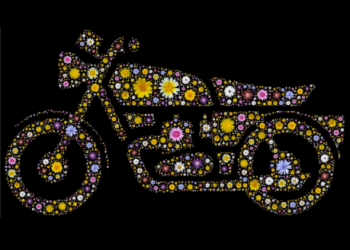 |
Composite Image Designs are constructed by algorithmically placing component images inside a template image. Some other examples include FlowerTank, Fish Tank, and John Lennon Flower Portrait. |
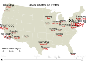 |
Oscar Twitter Map shows textual information extracted from tweets directly on a simple US map. The tool supports exploration over time and the text analysis shows things like which adjectives were most closely associated with particular actors at various times throughout the evening. |
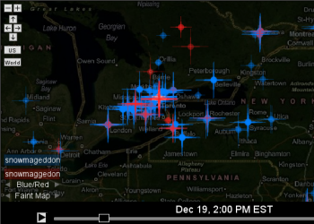 |
Zoomable Twitter Map supports exploring tweets along the dimensions of time, geography, and the actual message content. The timeline control can be played or manually scrolled, the map zoomed in and out, and filters can be defined that control which tweets to show. |
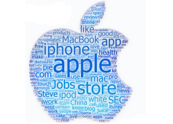 |
Shaped Word Clouds are similar to standard word clouds but the words are colored and positioned based on an underlying image. Some of my examples operate as standard HTML image maps as well and so can be used for navigation. |
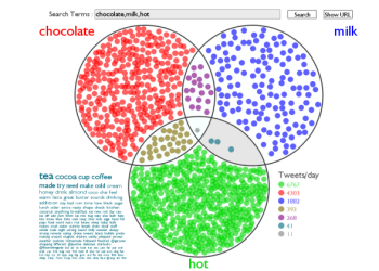 |
Twitter Venn takes two or three search terms and creates a Venn Diagram showing the rate of tweets containing the search terms in the various combinations. A tag cloud can also be shown for one of the regions. |
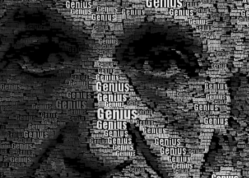 |
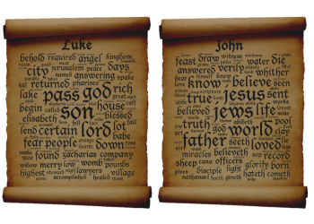
Word Portraits are images that are reconstructed using words in various sizes and colors. I create mine with custom code written in Processing. Here are a few examples: Obama, Einstein, World Peace, and Eyes from i's. |
 |
Clustered Word Clouds are an extension of the common word cloud idea. The words are partitioned into clusters based on how often they were used near each other in the base text. The largest clusters are then shown with the words in them positioned near each other and highlighted with color. |
 |
Sentence Bar Diagrams use a simple set of bars to show the sentences in a text. The bars are colored based on the primary topic of the sentence and the most common interesting words for a set of sentences are also shown. |
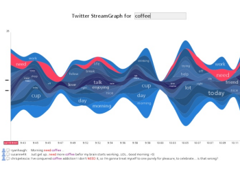 |
Twitter StreamGraphs is an interactive tool that shows the trends in word usage over time for twitter messages from a particular user or that contain a given search term. |
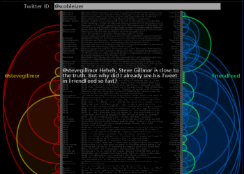 |
Twitter Arcs takes the latest 100 tweets for a twitter ID or term of interest and creates a list representation that has arcs connecting messages sent to the same users or that use the same primary term. You can click on the left side to load the tweets for a new user, on the right side to load the tweets for a specific term, and in the middle to visit the actual tweet. |
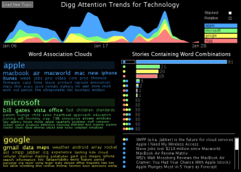 |
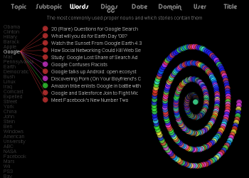
Digg Trends is an interactive tool that shows the trends in word usage over time and word associations for stories that reached popular status on Digg. |
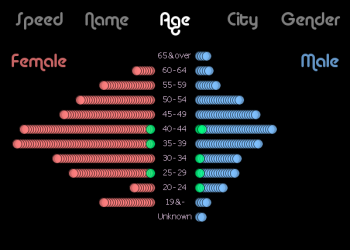 |
The Race Results Analyzer allows exploring results for a running race. The small circles represent athletes and they are smoothly transitioned between their positions within various graphical views. |
 |
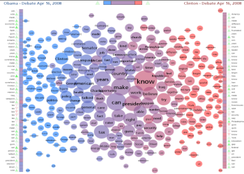
The Document Cloud Comparison tool links two Word Association Clouds together to support exploring the similarites and differences between two documents. |
 |
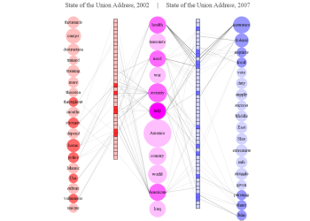
A Document Contrast Diagram is a visual summary of the content of two text documents that illustrates shared words, words that are unique to one document or the other, word frequency, relative size of the two documents, distribution of emotional tone within the documents, related words based on co-occurence, and the most common word in each document segment. |
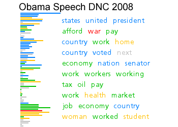
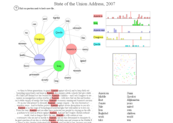
| The Transcript Analyzer is a tool to visualize debate transcripts. The top section shows the distribution of some selected words within the text across a 'timeline' which goes from left to right. Right below the word distribution graphs is another set of bars showing a spectral decomposition of the text based on who spoke and how much was said. In this case the bar heights give the amount of text for each segment. | |
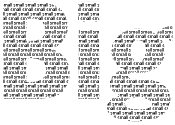 |
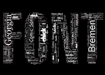
Big Small is a tool to support creating large text that is made up of words rendered in a smaller font. This is one of the simplest applications I've created but it probably gets the most use. |
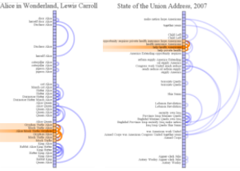 |
Document Arc Diagrams illustrate the similarity structure within a text document by drawing arcs connecting segments of a document that share similar vocabulary. |
 |
Digg Explorer is a tool for exploration of the 500 most recent popular stories from Digg. Visually it is very similar to the Race Results Analyzer in that it uses small circles to represent items of interest which are fluidly positioned in various ways to emphasize patterns of interest. This tool reached popular status on Digg itself which attracted a fair amount of attention. |
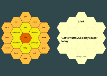 |
The Honeycomb Navigator is the result of a small freelance project I completed for the site ButterBeeHappy.com . Basically, the site lets you easily keep a journal of those things that make you happy or that you are grateful for. My Honeycomb Navigator lets you see the words used most often in your entries as well as which other words are associated with them. You can also explore the things that made you, or other people, happy by hovering over and clicking on particular cells. |
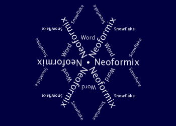 |
The Text Snowflake Creator is a simple tool to generate snowflake-like graphics from a few words or phrases. |
 |
Just for fun, I created a couple of designs with a modified version of Word Hearts and entered them into a contest for a T-Shirt design for typography lovers. |
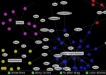 |
Digg Story Graph is an interactive visualization that shows the relationships between recent popular stories on Digg through the use of node and link diagrams. Stories can be visually connected through shared vocabulary, common topics, domain, submitter, or date submitted. |
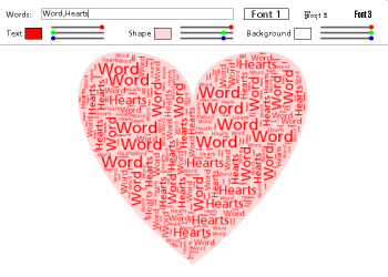 |
Word Hearts is a tool that automatically fills a heart shape with any words you like. Enter some words separated by commas in the text box and press the 'Enter' key. You can also choose one of three fonts or change the colors. |
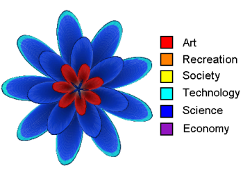 |
Topic Flowers are flowers generated based on properties derived from an input text. The words in the text are analyzed to determine the high-level topics that are discussed which are mapped to the colours used in the flower. Various other properties of the text drive things like number of petals, shape of petals, and the number of little hair-like fibers on the flower. |
 |
Shared Word Diagrams compare and contrast two documents by showing both the unique and shared vocabulary and its' distribution across the two documents of interest. |
 |
This Text Visualization Tool was an early exploration of a number of different views of the primary words in a document. The input, as it is for many of these tools, is a simple text file. All the textual analysis is done in realtime. |
 |
The Weblog Link Explorer is the result of playing around with Processing and Technorati data. It lets you explore the links to a weblog. |
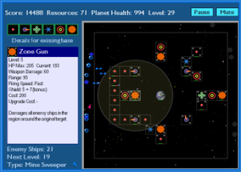 |
Home Planet Defense is a strategy game with a simple goal - protect your planet ! Build and upgrade bases in order to attack the incoming alien ships. How long can your planet survive ? |