Boing Boing Analysis - Part 7
By: Jeff Clark Date: Thu, 03 Aug 2006
Here are a few more interesting views of the Boing Boing post data.
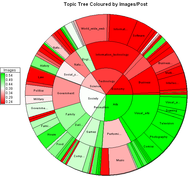
This Radial Treemap shows the topic hierarchy coloured by the number of images/post. It shows quite clearly that topics with a visual emphasis like Visual Arts, Drawing, Television, Photography, and Comics have more images/post than average. Some other topics have much fewer than average, including Business, Information Technology, Law, and Intellectual Property.
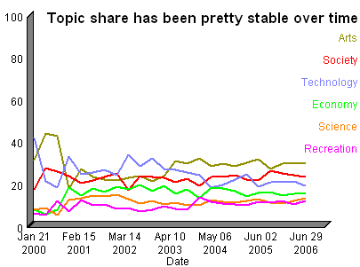
Here is a simple graph of the top level topic share over time. It shows more variability in the first year which is quite natural given the low volume of posts in 2000. Afterwards the share is pretty stable with perhaps a slight increasing trend for Arts at the expense of Technology.
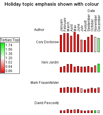
This graph shows the post volume for each month by author and uses colour to illustrate the fraction of posts related to the Holiday topic. Notice the obvious increase in December except for Mark. I looked for other topic trends or spikes over time and was surprised I didn't see very many.
Related Links:
Boing Boing Analysis - Part 1 (Posts Over Time by Author)Boing Boing Analysis - Part 2 (Posts Breakdown over Day of Week)
Boing Boing Analysis - Part 3 (Images/Post over time by Author)
Boing Boing Analysis - Part 4 (Outbound Links/Post and Acronym use by Author)
Boing Boing Analysis - Part 5 (Topic Hierarchy)
Boing Boing Analysis - Part 6 (Topic Emphasis by Author)
Boing Boing Analysis - Part 7 (Images/Post for Topics and Topic Share over Time)
Boing Boing Analysis - Part 8 (Incoming Links)