World News Streamgraph
By: Jeff Clark Date: Tue, 06 Jan 2009
Now that 2008 is over I've been thinking about looking at some datasets for the year. One that I have started to explore is a set of world news headlines from my local paper, the Toronto Star. I used some great information I found in here that shows how to use Google Reader to get the latest RSS entries from any feed. The dataset includes 1311 stories and I looked at both the title and summary text for this analysis.
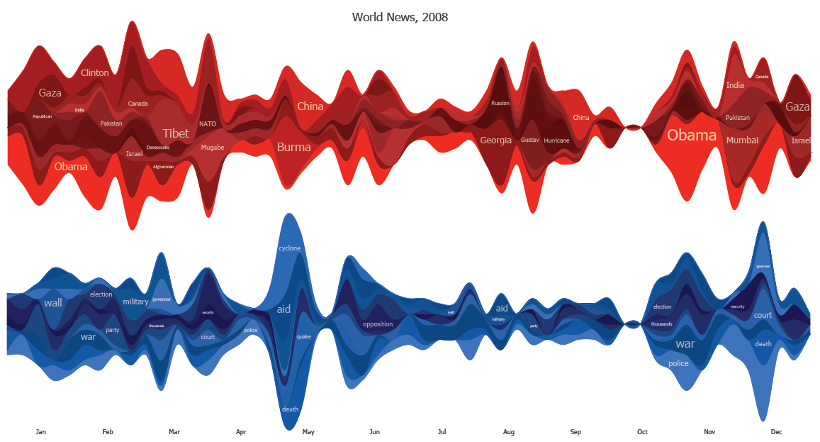
The image shows two StreamGraphs. The top one in red shows the most common capitolized words and when they appeared during the year. The blue StreamGraph shows the popular non-capitolized words over the same time period. The graphic seems to do a reasonable job showing the primary international news events of the year:
- Obama throughout most of the year with coverage peaking at election time
- Wall between Gaza and Egypt in early 2008
- Tibet in March
- NATO, Mugabe in March/April
- China, Burma, cyclone, quake, aid around May
- Georgia,Russia,Hurricane Gustav in August
- India,Mumbai, and Pakistan in late November
- Gaza and Israel again at the end of the year
This technique does have many obvious drawbacks as well. It doesn't really show which words are related - we can guess a relationship at times based on our own memory of the events. For example, there is an obvious burst around the end of April for Burma,China,quake, and cyclone but there is no visual indication of which goes with which. Was the quake in China or Burma ? Or perhaps the references occurred around the same time but were not related ? From the graphic you can't tell. There are also the common StreamGraph problems of thin or unlabeled slices that don't carry much useful information at all.