Document Contrast Diagrams
By: Jeff Clark Date: Thu, 20 Mar 2008
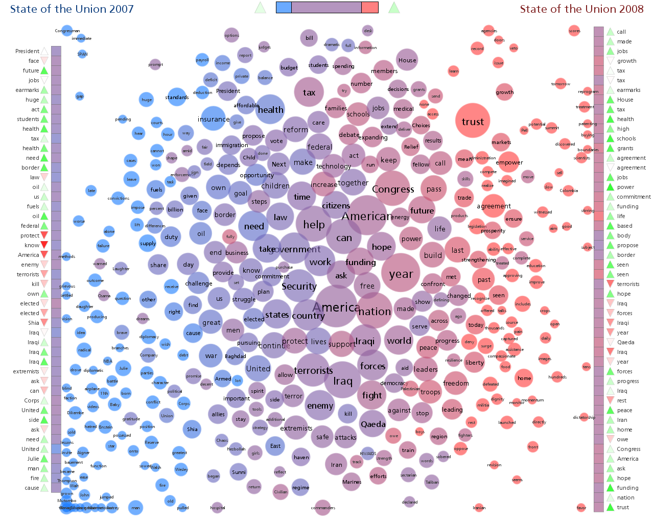
A Document Contrast Diagram is a visual summary of the content of two text documents that illustrates shared words, words that are unique to one document or the other, word frequency, relative size of the two documents, distribution of emotional tone within the documents, related words based on co-occurence, and the most common word in each document segment. Have a look below at the Document Contrast Diagram for the 2007 and 2008 US State of the Union (SOTU) Addresses. If you wish you can click on the image to see a larger version.
I'm hoping that much of the following is reasonably intuitive but here are a number of points regarding interpretation:
- The titles show that the 2007 version is on the left and the 2008 version on the right. The colour blue is used to represent the left document, and red for the right. Various shades of purple are used to represent intermediate states between the two documents.
- The column of squares towards the left hand side represents the segments of text from the left document. The topmost square is the first part of the document. Similarly on the right hand side. The larger of the two documents has 50 segments (squares) and the smaller document proportionally fewer. The columns of squares in this example show that the 2008 SOTU address was a bit longer than the one delivered in 2007. If you look carefully you can tell that the colours vary slightly in each square. The squares are coloured to show how the words used in that segment are distributed across the two documents. These two documents share a great deal of common vocabulary so most of the squares are purplish. If the square is reddish it indicates that the words used in that segment are more common in the rightmost document than the left. Similarly, a bluish square has words more common in the leftmost.
- The set of circles represent the most frequently used non-trivial words from the documents. Words that are in blue circles are unique to the left hand document and those that are in red circles are unique to the right hand document. Words that are used in both will be in an intermediate (purple) hue. We can tell at a glance, for example, that the word 'insurance' is likely unique to the 2007 SOTU, the word 'trust' is likely unique to the 2008 SOTU, and the word 'America' is common to both. We can't tell for sure that 'insurance' is only used in 2007 because the colour might actually contain a slight amount of red - say if the word was used 100 times in 2007 and only 1 time in 2008. The colour blending does seem to give a reasonable qualitative indication.
- The size of the word circles indicate the frequency of that word in the two texts.
- Horizontal position of the word typically shows which document uses it the most. For example the word 'year' is slightly to the right of center which suggests it was used more in the second document. The horizontal position approximately correlates with the colour. Blue to the left, purple in the middle, and red on the right.
- Vertical position of a word circle is influenced by where that word was used within the two documents. Word circles are attracted towards the little document segment squares where they are used. A word used near the beginning of the documents will appear towards the top. The word 'trust' for example is used much more often near the beginning of the documents than at the end.
- Word circles are also positioned near the circles for other words that are used together within the text. So, this diagram shows that the words 'Iraq' , 'enemy' , 'fight', 'forces', 'kill', and 'terrorists' are associated with each other in the documents. The position of a particular word depends on many different factors including related words, where it is used in the two documents, repulsing forces between word circles to minimize overlap etc.
- Next to each document segment square is a little arrow pointing up or down. These indicate emotional tone for the vocabulary used in that segment. Words like 'love' , 'peace', 'happy' have a positive emotional tone and words like 'war', 'hate', 'racism' have a negative emotional tone. Darker hues indicate a stronger tone.
- Next to each emotional tone arrow is the most common non-trivial word used in that segment. This right hand side document contains a fairly dark red down arrow around the middle and beside it is the word 'terrorists'. This indicates that during the middle of the 2008 SOTU delivery the word 'terrorists' was indicative of what was being said and that the emotional tone was negative. Note that this measure of emotional tone is very simplistic - it only considers single words in isolation. So the phrase 'end the killing' would be considered to have negative tone since the word 'killing' is recognized as negative and the semantic inversion supplied by 'end the' is ignored.
- At the top in the middle is a bar showing how much vocabulary is unique to one document or the other and how much is shared (in purple).
- At the top near the bar are two emotional tone arrows that give the average tone for each document.
It's far from perfect but it does seem to give, at a glance, a pretty good idea of what the two documents are about, how they are similar, and how they differ.