9/11 Pager Data Visualization
By: Jeff Clark Date: Sat, 28 Nov 2009
The organization Wikileaks recently published a data set of pager intercepts from the 9/11 tragedy. As described on their website:
Text pagers are usually carried by persons operating in an official capacity. Messages in the archive range from Pentagon, FBI, FEMA and New York Police Department exchanges, to computers reporting faults at investment banks inside the World Trade Center
The archive is a completely objective record of the defining moment of our time. We hope that its entrance into the historical record will lead to a nuanced understanding of how this event led to death, opportunism and war.
I have taken this data and done an analysis for 100 phrases selected to summarize the events of that horrible day. I have focused on the time period from 8am until 8pm, September 11th, 2001.
This video below shows a Phrase Burst Visualization of the data. The larger the text the more frequently it was used during the 12 hour period. Text appears bright during the times of high usage and fades away otherwise. The color hues are cosmetic. This phrase burst visualization is basically a word cloud where the brightness of the words varies according to how prominent the words were during specific periods of time. You can drag the playhead for the video around to examine specific times.
Pager Data from 9/11 - Phrase Cloud Visualization from Jeff Clark on Vimeo.
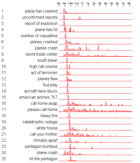
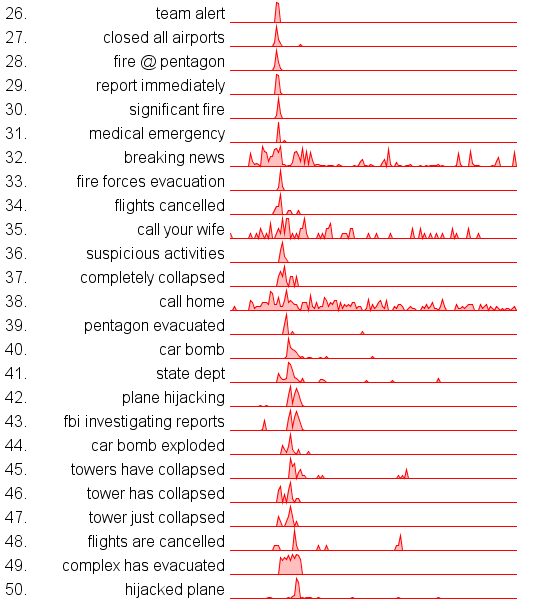
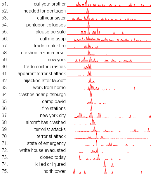
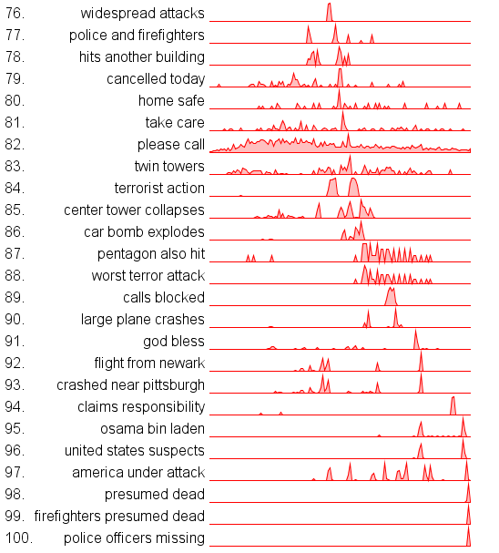
Perhaps a more useful view of the data is provided by this set of timeline graphs. They are ordered by the time of the highest peak for the phrase and in this arrangement provide a narrative of the events.
Video, graphing, and analysis done with custom code created with Processing.
If you like this work you might want to 