Toronto Twitter Community
By: Jeff Clark Date: Thu, 12 Feb 2009
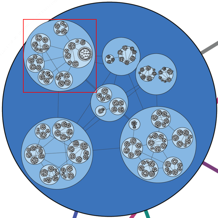
I have created a structural map of the Twitter community based in the area where I live, Toronto, Canada. Tweets were gathered using the Twitter Search API for a radius of 50 miles around Toronto during the two week period January 17-31, 2009. This yielded 337,782 tweets - approximately 24,000 tweets/day. Of these, 147,166 tweets contained an @ reply directed to at least one other twitter ID. These messages were analyzed to count the number of tweets between pairs of people both residing within the Toronto area. The final raw dataset defining the structure of the community had 3938 distinct twitter IDs and 18,831 relations connecting then together.
Such a large set of nodes and edges is difficult to represent visually in a pleasing manner. With this many connections a standard node and edge diagram is usually a tangled mess. I tried to overcome this by clustering nodes together in a hierarchical fashion based on the connections between them. Connections between individual twitter IDs are only drawn if they are within the same group. Edges are drawn at the group level to show relationships between groups.
If you want to examine the structural map more closely then look at the PDF version of the Toronto Twitter Community Structure. You can do a text search on a name within a PDF viewer to see where you are and who you've been grouped with. Note that a bug in my tools prevented me from placing the text labels precisely where I wanted and when they overlap with another label the text search may fail.
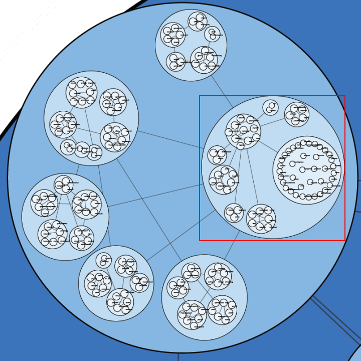
The first image below shows the overall structure. The area in the red square is shown at a higher resolution in the image that comes after it.

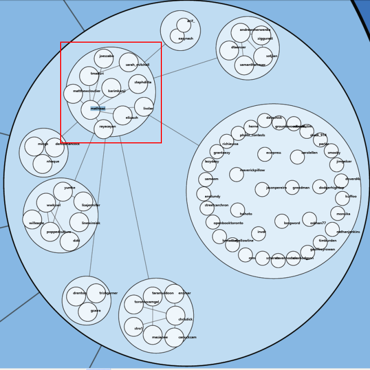
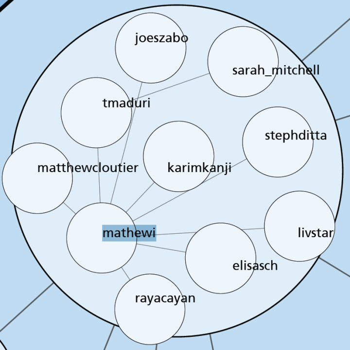
This sequence of 5 images takes us from the whole community to a small group surrounding Mathew Ingram (mathewi), who is a technology columnist at The Globe and Mail and is well known in the Toronto Twitter community. It clearly shows the Toronto-based people he communicated with on Twitter using the @ reply mechanism during the last two weeks of January. For one of these people, sarah_mitchell, there was no direct connection but they were grouped together because Sarah had strong ties to tmaduri.
The second last image shows connections coming out of Mathew's group into several other groups. This shows that there are connections between some of the individuals inside these groups. The clustering algorithm imposes constraints on how large the groups can get so they can't all be placed in one giant group. These high order group connections can occur at every level so it is possible that Mathew had conversations with other people, perhaps some on the far side of the map in the red region. However, the intent is to show most of the people that were tightly bound within the same immediate group.
Note that this diagram completely ignores who follows who on Twitter. It's based entirely on @reply data. There may very well be important members of the community that didn't use @replies to other Toronto people during the time period and so do not show up.
By the way, feel free to follow me on Twitter if you would like to discuss this or hear more about my work in the future. I'm at http://twitter.com/JeffClark
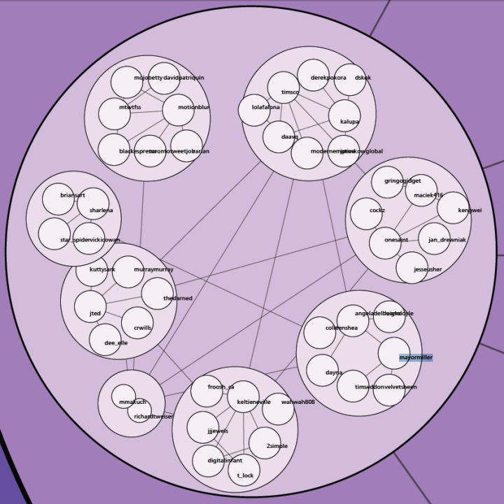
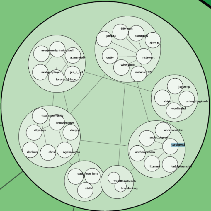
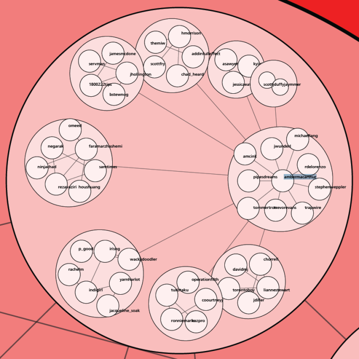
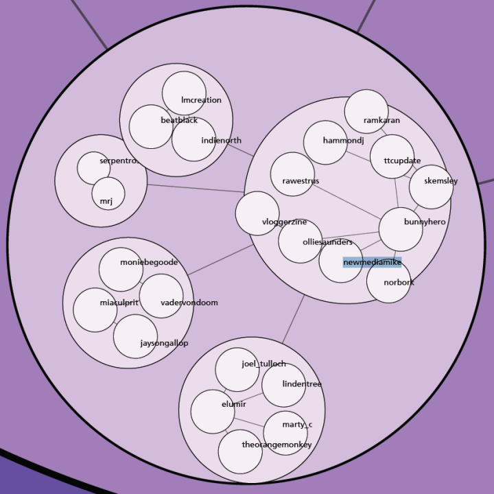
Here are a few more images showing some popular members of the Toronto Twitter community - mayormiller, torontoist, ambermacarthur, and newmediamike .
Thanks to Twitter for the data and Processing.org for the tools I used to write the code that does the analysis and layout. Special thanks go to Jeffrey Traer Bernstein for developing the Traer Physics Library which I used to create the layouts.