Word Cluster Diagram
By: Jeff Clark Date: Mon, 18 Apr 2011
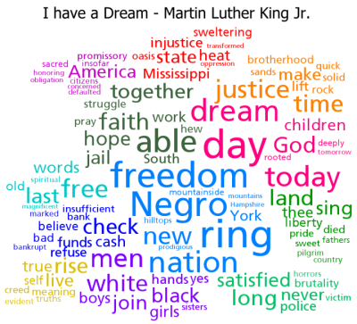
A few years back I introduced the idea of Clustered Word Clouds which use word size to indicate frequency but also use positioning and word colour to group words together that were highly correlated in the text. It works reasonably well I think. See the example below:
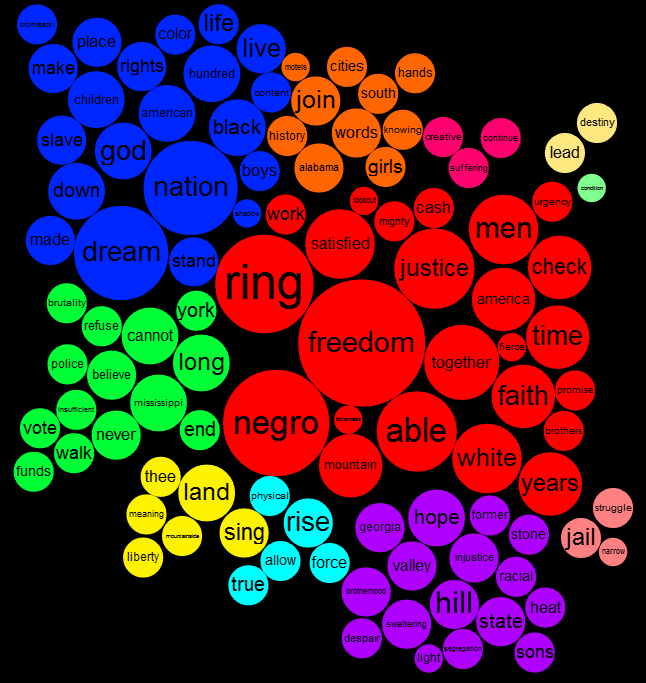
I've come up with a new variation on this idea that tries to improve a couple of things. In many word clouds, including those generated by Wordle and my clustered clouds, the font size of the words are proportional to the word frequency. This has the effect that words with many letters (for example 'indisposed') cover a much greater area than a word with fewer letters (say 'ill') if they have the same word count. Some word clouds are constructed so that the area of the word is proportional to the word count rather than font height. This often has the opposite effect of unnaturally emphasizing words with fewer letters. My new design uses solid circles of colour whose area is proportional to the count. I think they may do a slightly better job of giving the proper visual emphasis to the words.
By using larger blocks of colour I think it's also easier to visually distinguish the groups in a clustered cloud. I'm calling this new variation a 'Word Cluster Diagram'. The one below is for the same text as the older style above but the clustering algorithm, and stop word list are a bit different so they aren't directly comparable. I think it has some promise although it's not as space efficient as using the words on their own.