Movement in Manhattan
By: Jeff Clark Date: Wed, 18 Apr 2012
Inspired by the beautiful and elegant Interactive Wind Map created by Fernanda Viegas and Martin Wattenberg I have begun to explore the flow of people within a city. An ideal dataset to do this would include the GPS traces from thousands of people wearing trackers for weeks as they go about their daily lives. Organizations such as crowdflow.net and OpenPaths collect voluntarily donated data of this type and might be fruitful to explore. I decided, instead, to use geolocated tweets to try and see how the movement of people is affected by the urban landscape.
The image below shows an area of Manhattan roughly from Houston Street north to 72nd Street which corresponded to the region with the most geolocated tweets that I collected. It includes Times Square, Grand Central Station, the Empire State Building, Rockefeller Center, the southern portion of Central Park, and many other well known landmarks. The blue and red markings are an attempt to show the flow of people based on the data.
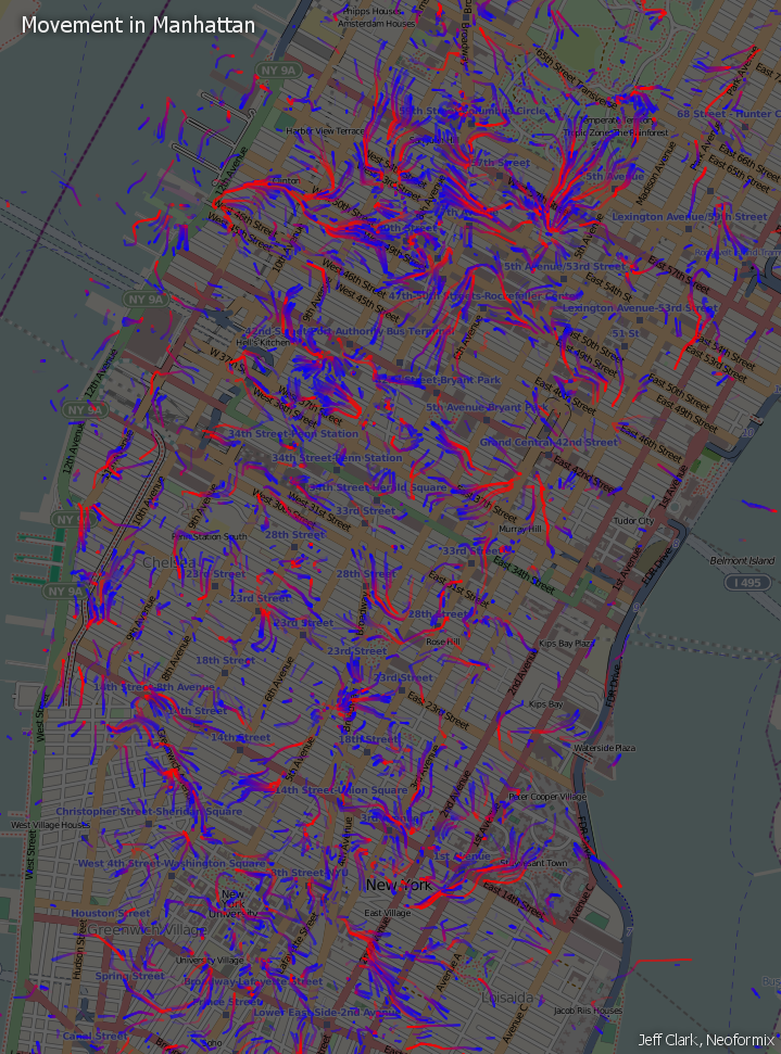
Basically, tweets sent by the same person within a 4 hour time-window were used as samples of speed and direction. These samples were used to construct a vector field representing the average flow of people within the area. The vector field and total tweet density over the space were then used to simulate the movement of people. Particles, representing people, were released at locations where actual tweets were recorded and their subsequent movement was determined by the flow field. The particles start out blue and gradually change through purple to red over time so each trace shows the direction of movement. Locations where there is little movement will have blue dots or very short blue traces. Longer traces with more red show a greater speed at that point.
The density and direction of the flow patterns seem reasonable but they do appear fairly chaotic - much more so than the patterns seen in wind flow for example. This makes sense for many reasons. One, people are much less deterministic than the molecules that make up the air. Secondly, the environment that they exist in is extremely complex. Also, statistically we are dealing with a much smaller sample size. In this case, roughly 34,000 geolocated tweets with only 9,600 path segments. If we had a million-times more data then the average patterns would be more clear. Another important factor is that this data was collected over a few days and so there may be clear patterns for specific times of day that are mixed together visually.
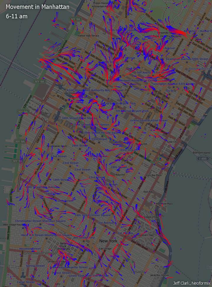
I have produced three more images that separate out the data by time of day. This first one only uses data from 6-11 am. It does appear to be a bit simpler and shows a few interesting patterns but it is still fairly chaotic. There is a strong flow east out from Central Park near 65th Street. There is also a more scattered flow from the east into New York University near the bottom left.
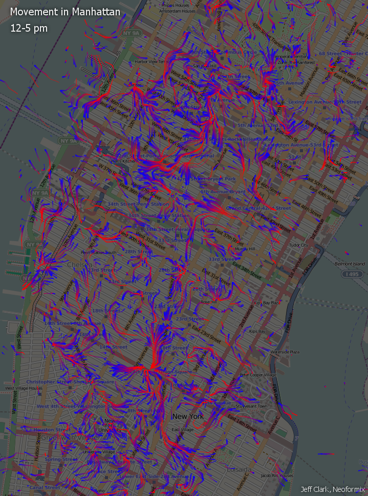
The afternoon flow map shows a greater overall density indicating a greater number of locations from which people are tweeting. There also appears to be a strong convergence on the area of 14th Street - 4th Avenue.
The evening map is also quite busy with lots of small local patterns. There is heavy action between 50th and 57th Streets. Comparing these three versions is easier with this Flickr lightbox version of the images.
Overall, there are lots of flows and some of them likely reflect real movement of people within Manhattan. Many others probably just reflect noisy data because the sample size is so small. It's difficult to distinguish between the two cases here. The technique itself might warrant further study with more data. Another interesting avenue to explore would be to more directly visualize the data with an animation like this 'Fireflies' video showing iPhone traces done by Michael Kreil.

The geolocated tweets were collected with the library Twitter4J which was used from code written in Processing. I used this tutorial created by Jer Thorp to get started with the library. Code from this flow field sample by Daniel Shiffman was used as a starting point to create my flow maps. The background map is from OpenStreetMap. Thanks everyone!