Map of the Market
By: Jeff Clark Date: Sun, 09 Apr 2006
A few years ago I stumbled across an interesting visualization of stock market information. It is called Map of the Market. It shows the market capitalization and fluctuations over time of hundreds of publicly traded companies. It was created in 1998 so many of you have likely seen it before. I wanted to mention it here because it triggered a renewal of my own interest in the area of data visualization.
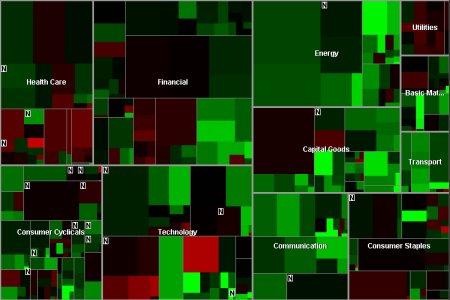
This application was created by Martin Wattenberg who is currently a researcher at IBM. I think it does an excellent job of organizing large quantities of data in a useful fashion. The area of the rectangles represents the market cap of a stock and the colour can be mapped to many different quantities. In this example, colour shows the Year-to-Date change with red showing negative change and green positive.
The different stocks are grouped together by sector and the interactive map supports zooming in to get a more detailed view. With this tool you can get an immediate impression of how the market is doing overall, the relative performance of various sectors, and easily spot outlier companies that are under or over-performing with respect to their sector. I'm not going to describe it in any more detail here since you can try it out yourself.
This visualization technique is called a Treemap and was developed by Ben Shneiderman in 1990 at the Human-Computer Interaction Lab at the University of Maryland. For a summary of the history and many examples of variations on the idea read Treemaps for space-constrained visualization of hierarchies. In recent years there have been many prominent applications of this technique and I'm sure this won't be the last time they are mentioned here.