Data Visualization Field on Twitter
By: Jeff Clark Date: Sun, 26 Feb 2012
I consider myself one small part of a community on Twitter that focuses on information visualization, computational design, and interaction design. Collectively we tweet about our personal work, highlight other work of quality or that has interesting characteristics, critique approaches or individual designs, discuss tools and techniques, and suggest interesting datasets or projects. I'm grateful to be connected with such an interesting group of people and I've learned a great deal from them.
Moritz Stefaner is an important part of this group and in July 2011 he created an interesting map of this community he calls The VIZoSPHERE. Basically, he started from a set of 18 selected twitter accounts, found their friends and followers and included any twitter account that met a minimum criterion of connectedness. A small version of part of this map is below. Node sizes reflect the number of followers within this community.
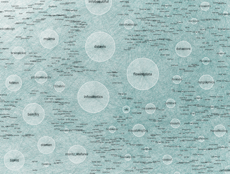
It's a fairly standard graph view of the network data and the sheer number of connections makes them extremely difficult to traverse. Like many such large network graphs the primary utility seems to come from seeing which nodes are largest and seeing which ones seem to be grouped together, presumably reflecting nodes that have a similar set of connections to the rest of the network or strong connections between them. This can sometimes visually suggest sub-groups within the overall community.
After stumbling across this work recently I decided to explore the same problem myself. Rather than rely on follower information for connectedness I decided to analyze the actual tweets sent and look for mentions of twitter IDs. These could be retweets, replies, or just references to someone in a tweet. For a given twitter account we are essentially looking at who they talk to or talk about. Unlike the binary nature of the follower connections we can also measure the strength of this connection by looking at how often one person mentions another.
I started with the same set of accounts that Moritz used: @moritz_stefaner, @datavis, @infosthetics, @wiederkehr, @FILWD, @janwillemtulp, @visualisingdata, @jcukier, @mccandelish, @flowingdata, @mslima, @blprnt, @pitchinteractiv, @bestiario140, @eagereyes, @feltron, @stamen, and @thewhyaxis. I looked at the 1000 latest tweets (or as many as they had if they hadn't sent 1000) and found all the twitter accounts they mention. For each mentioned account I calculated its' support - the number of accounts in the original 18 that mentioned it and used that ranked list to enlarge my set to 50. The latest 1000 tweets for this larger set were retrieved and analyzed in the same way to enlarge the community to 100. I repeated this once more and used tweets from these 100 accounts to finally get a list of the top 1000.
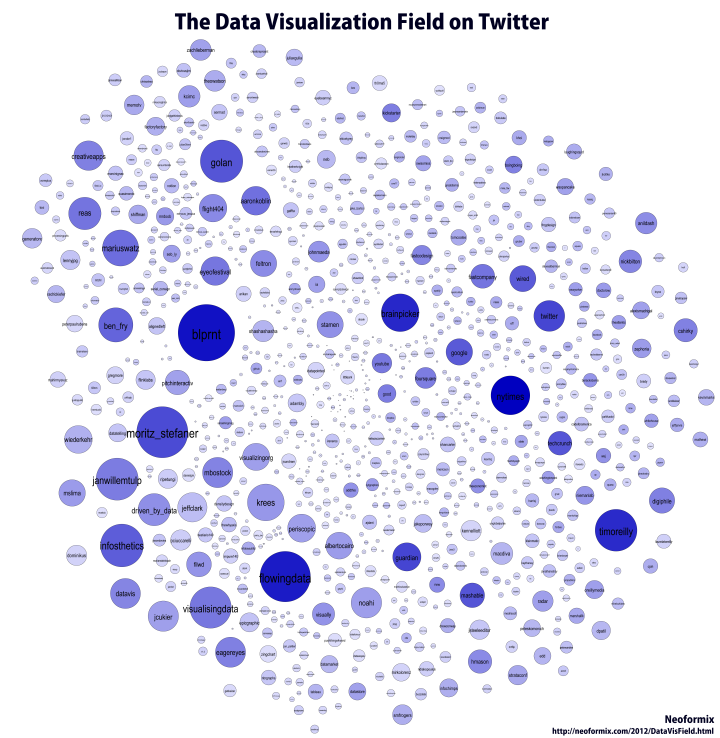
The total number of tweets analyzed for these 1000 accounts was 821,407 and I used them to determine a directed connection strength between each pair of accounts. This connection data was loaded into Gephi which I used to produce the graph below.
For a searchable and zoomable version use the PDF.
As in Moritz's VIZoSPHERE there were so many connections that I didn't think they provided any useful information that could be seen with the eye so I left them out. They are used to layout the nodes for each account and also the node sizes are determined by the degree - the number of edges coming into or out of the node. The bigger nodes can be read off from this graph - @blprnt, @moritz_stefaner, @flowingdata, @visualizingdata, @janwillemtulp, @infosthetics, @golan, @mariuswatz, @reas, @ben_fry, @brainpicker, @nytimes, @timoreilly. Many of these larger nodes are, unsurprisingly, the original seed accounts we started with.
Looking at the details of which accounts are placed near each other seems to give reasonable results. @Eyeofestival is near @blprnt, @krees near @periscopic, and @mccandelish near @infobeautiful. It's very likely that many nodes are placed near each other based on more global or indirect factors so there are still likely some surprising juxtapositions.
Many of the initial seed accounts are in the lower left part of the diagram and seem to reflect a subgroup focused more on the practical aspects of data visualization. The top left accounts seem more to be in the area of computational design, generative art, or design in general. @Blprnt seems to lie between these 2 subgroups. The right side of the diagram seems to be more general media and data sources. I suspect that many of the accounts on the left side mention those on the right but the reverse is not true. In fact, I suspect that many of the accounts on the right side aren't really part of the community in that they don't strongly interact with it. They are sources but not contributors. It would be interesting to repeat my enlargement process from the original seed accounts with some minimum criterion for two-way interaction.
The nodes are colored based on the total number of incoming links which represent people in this community mentioning that account. The darker the color the more incoming links there are. So there are a lot of different people within this community referring to @blprnt, @flowingdata, @brainpicker and @nytimes for example. You can't extract much quantitative detail from a color range but it does give you a feel for which accounts are highly referenced. Note that the color is based on the absolute number of incoming links - not the proportion of incoming to total links. That would be a more interesting measure but I couldn't easily map it to color with Gephi.
This looks like an interesting view of the data and I'm curious to explore a few related variations. Note that prominence within this graphic is a fairly crude measure of overall contribution to the field of data visualization. Many key figures in the field, Stephen Few for example, don't use twitter and so aren't represented here even though his critiques have a huge impact and are discussed within the twittersphere. Many others, such as Ben Shneiderman (@benbendc) and Edward Tufte (@edwardtufte), do use twitter but not extensively and not to a level that reflects their value to the field. They do appear in this map but have very small bubbles.