Data Visualization Field Subgroups
By: Jeff Clark Date: Tue, 28 Feb 2012
There was some interesting discussion yesterday on Twitter about my post on the Data Visualization Field on Twitter. Moritz Stefaner pointed out that he didn't see a big improvement over his VIZoSPHERE and a quite similar topology. Furthermore, he noted that if you rotate my version 90 degrees counter-clockwise many of the primary nodes line up fairly closely with his. He's right, and it's something I missed noticing completely. It's not really surprising that an analysis of most of the same twitter accounts using a different connectedness metric would yield similar results. I do still feel the map based on tweet text account references is slightly better at the detailed local level but I have no objective evidence that this is the case.
Another interesting thing I learned yesterday was that Lynn Cherny did an excellent analysis of Moritz's data back in September which is reported in Combing Through the Infovis Twitter Network Hairball. She focused on the detection of sub-communities within the network using both Gephi and NetworkX and has some nice results.
Following Lynn's lead I have spent some time looking at the communities within my data. Doing this analysis with Gephi yields subgroups that look like this:
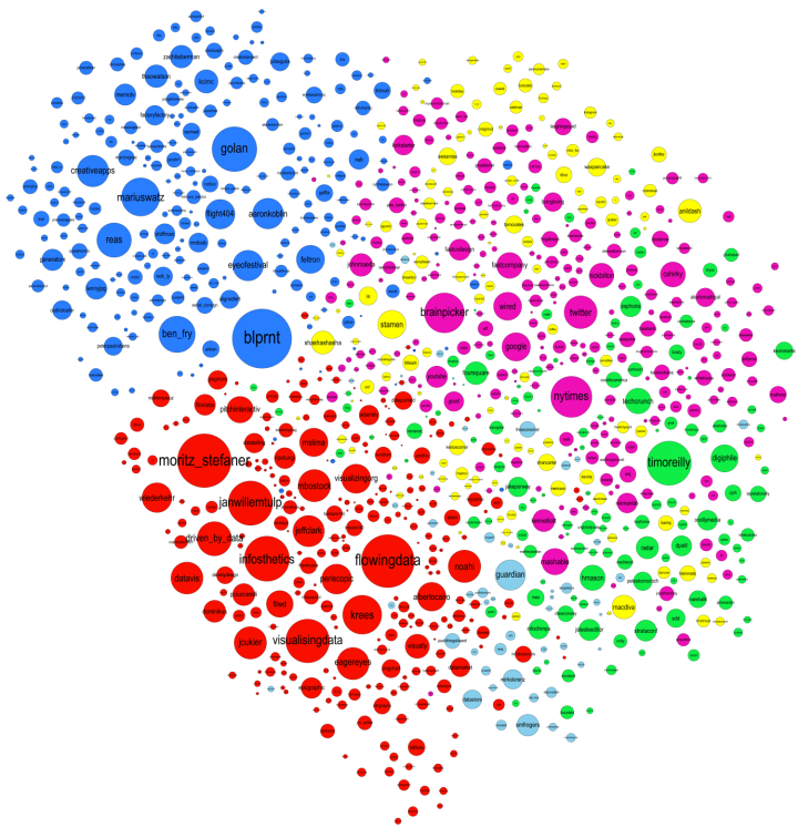
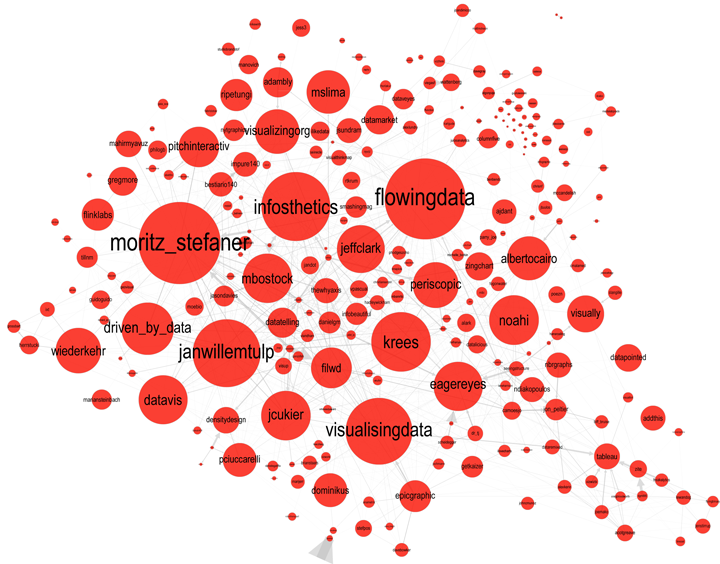
The modularity score was .356 which is slightly under the .4 boundary for significance. By visual inspection of the image above it seems clear that there are two coherent groups to the left and four other groups that are intermixed and less clearly defined. These two coherent groups correspond pretty well to what I saw by eye yesterday. The top-left blue group has people who focus on computational design, generative art, or design in general. The bottom-left red group, as I noted yesterday, seem focused more on the practical aspects of data visualization.
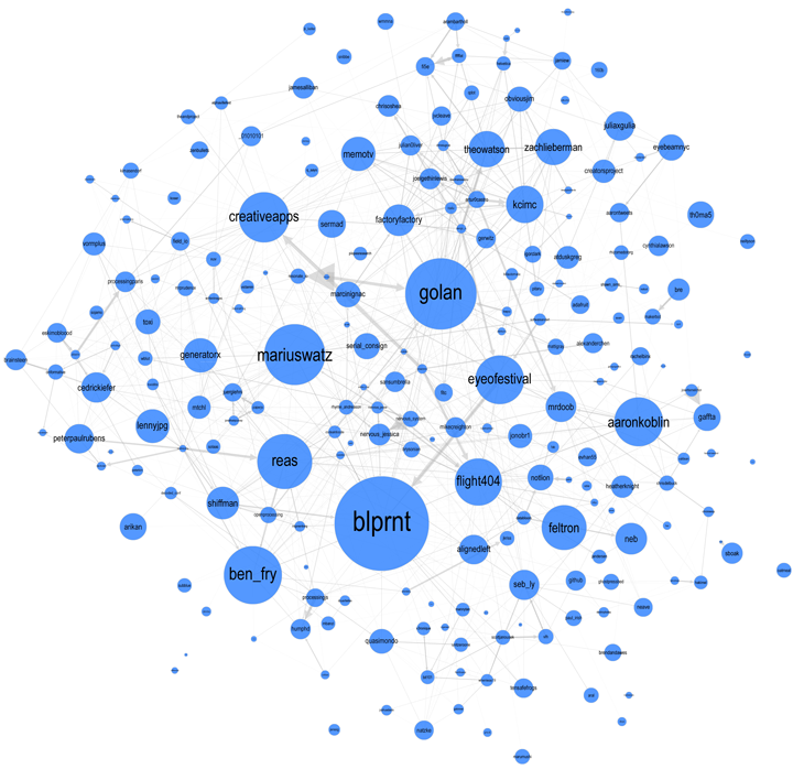
Below is a map showing only the blue group. I've also shown the top 3% of edges as well. I wasn't able to emphasize the flows as much as I would have liked but you can see some of the stronger edges and their direction. One of the strongest relationships visible in this map goes from @eyeofestival to @blprnt which indicates that a relatively high fraction of the tweets sent by @eyeofestival mention @blprnt.
Here is the map for the red group below. Note that you can click on any of these images to get PDF versions where you can zoom in or search for a particular account.